Showing posts with label painting. Show all posts

Tuesday, 10 June 2014

April/May roundup

I've been sort of beating myself for not painting/drawing all that much in the last few weeks, but gathering all the sketches and such from mid-April onwards, the sum doesn't look too meagre after all. :)

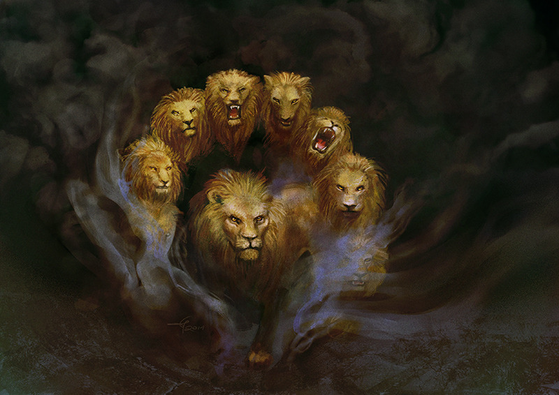
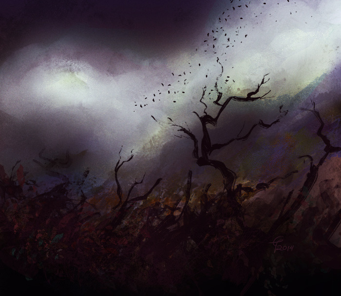
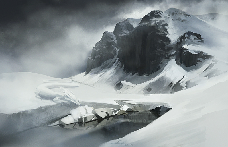
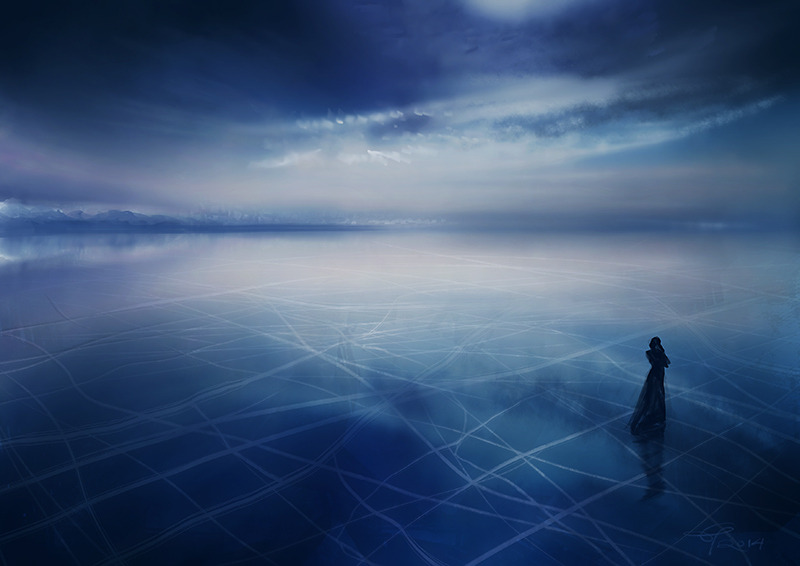
First, two illustrations for Zeitgeist:


Fanart for Angeliki Salamaliki's Monsieur Charlatan webcomic:


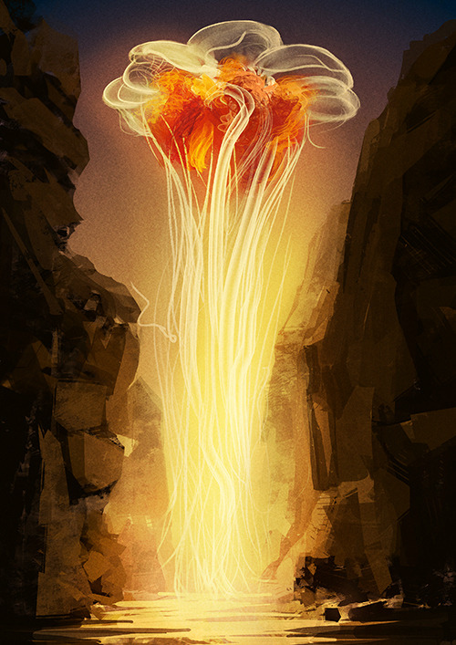
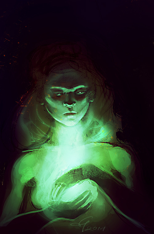
I spend a couple days re-organised my brushes in Photoshop, with these two cropping up from the process:


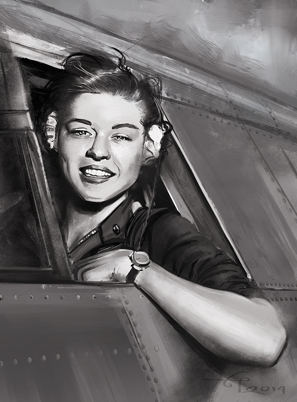
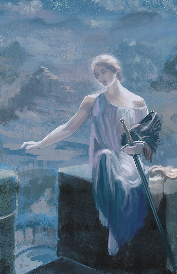
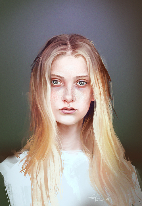
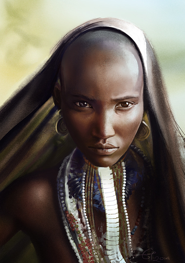
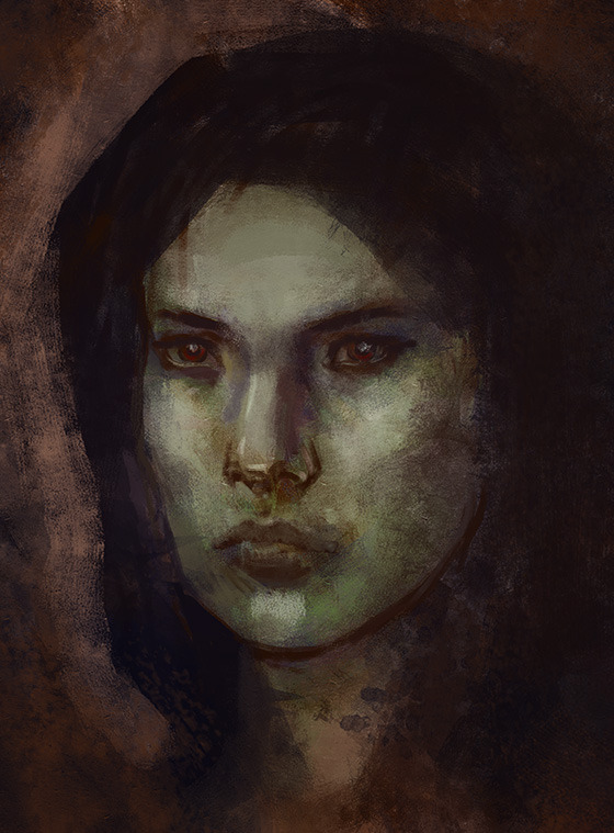
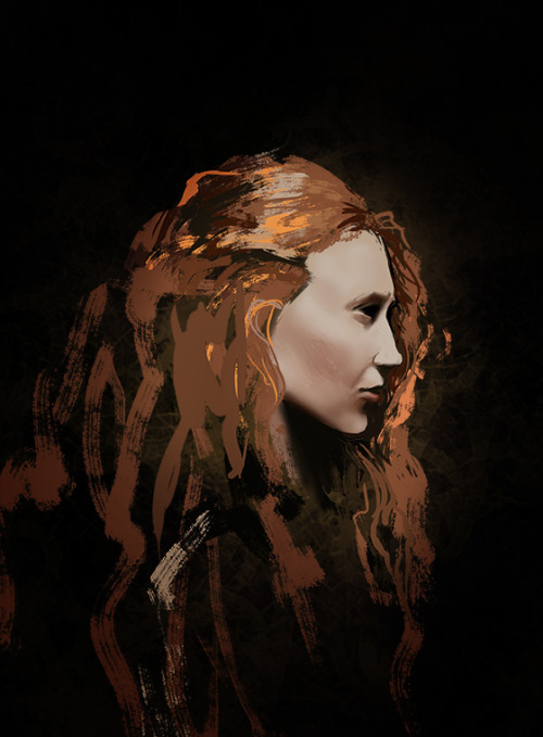
Some portraits: my femshep from Mass Effect, referenced from screenshots, two more photo studies, plus one quick master study, The Valkyrie's Vigil, by Edward Robert Hughes.


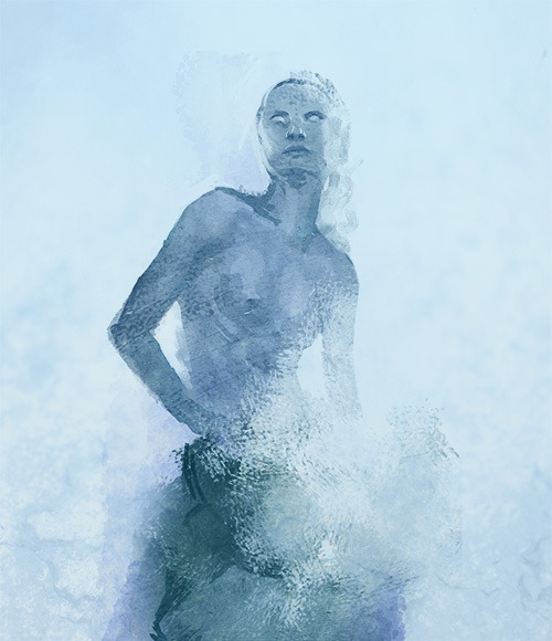
And a few figure studies; the first batch are referenced, the second (probably obviously) not.


Tuesday, 25 March 2014

Photo studies & Daily Spitpaints, March 2014


Reference: Nastya Kusakina photographed by Jurij Treskow


Reference: Rufo, Arbore Tribe, Lower Omo Valley, Ethiopia - by Joey L.

One thing I figured out while painting these portraits was rendering smooth face planes with the airbrush. I’d tried it in the past but the result would usually end up blotchy and plastic, partly due to poor control. This time I kept airbrushing in a new layer set in dissolve mode. When I was done, I would convert the layer to a smart object, rasterize it, turn it back into normal mode (it would keep the ultra-sharp speckles from dissolve mode), then blur (Gaussian, between 1.0 and 1.4 radius) and lighly erase where needed for a softer effect.


Reference: Drakolimni, Mount Tymfi, Epirus, Greece. I took some liberties with the look of the resident 'dragons'. :}

I also joined the Daily Spitpaint group on Facebook, and have painted a couple prompts. The 30' limit is a hit or miss, and I'm not always sure it's a good thing to rush things. While working fast and under pressure keeps me on my toes, I may take shortcuts to make something presentable instead of learning from it as I would if I were to take my time. Or perhaps I'm just out of practice; I should keep doing these.

Thursday, 27 February 2014

Commissioned RPG characters

These were commissioned for an urban fantasy setting, about which I admittedly know very little, except for the very detailed (and helpful) descriptions of the characters:


Marcus 'Littlepike' Coates (top), Victoria 'Threeleaf' Glyn, and Psellos Tarsitos. My favourite of the three is Coates; his description mentioned 'chill' mannerisms that I think more or less came through. By saying he's my favourite, though, I actually mean that I find the other two rather awkward. :p

Painting these characters has been an important learning experience, in that I actually tried to learn from my mistakes instead of just fret about them. I generally don't paint very consciously and tend to over-rely on what Bob Ross would call 'happy accidents', which have sometimes turned out impressive enough, but the rest of the time I find that I have great difficulty in fully directing my paintings or being accurate in depicting a vision I or someone else may have.

Mentioning these things here feels a bit like rediscovering the wheel, but someone else might benefit from reading them like I did from noting them down as I faced each hurdle (or success!).
  • Thumbnails. I'm always stingy with thumbnails and tend to jump into painting after I get a single sketch to look more or less right. I've come across professionals suggesting 2-digit numbers for thumbnails, and they have a point.
  • Find or make the right reference. Probably not necessary in concept or looser work, or if I were really confident about my anatomy skills or about how different objects and materials may look under different angles. I'm not at all confident. Reference saves my butt. I might pull things off without, but I might mess things up entirely and have to backtrack (see also point 4).
  • Set up values and colour schemes. Decide on a light source and don't ignore or forget about it during rendering. Maybe even make a silly little arrow on a separate layer and keep it there as a reminder.
  • Clean up drawing and double check for errors (flip the canvas, walk away from it for a while, show it to someone else). There are things that can and probably will have to be corrected or changed during rendering, but a solid drawing saves time - and frustration.
  • Render... but don't over-render. That last one depends on personal style, but one thing looser works have going for them is that whatever detail is not in the painting is usually mentally filled in by the viewer in the most favourable way. 
 
I don't see these steps as some sort of holy grail, and I feel it shouldn't all become a mechanical process; I like a bit of mess in my paintings, just not when it spills over everything I'm trying to do with a painting.

Wednesday, 19 February 2014

January/February sketches

I made it a New Year's resolution to get back into painting in 2014, because 2013 saw me paint very little if at all. I set a weekly schedule of evenings and weekends, a range of 10-30 hours; 45 if I really push it, forgo sleep, and do nothing else after getting back from work but sit and paint.

In theory, it's more or less reasonable, but in practice it requires 30 hour-long days and not much of a life beyond. I also realised I cannot always sit eight plus hours in front a computer screen at work and expect to spend another four or five at home. So all that didn't work out too well. :}

Still, I managed to finish a trio of commissioned portraits, a character lingering in a semi-finished state since 2011, and while I absolutely don't get to sketch daily, it's gotten more regular. I'll post the characters separately; for now, here are the sketches:


The rest is all digital:


For the record, I was happy to find out that eye drops really help. ;)

Monday, 11 November 2013

2013 bits and pieces

2013 has not been a very good year art-wise. I moved house in late December 2012; my new place was a dilapidated mess, previously uninhabited for some 10+ years. Between full-time work and trying to tackle said mess so that it resembles a habitable space, my art productivity dropped entirely.

The sum of what I managed to paint or sketch this year is this:


The last piece is a WIP and is going relatively well, so I suppose the next update won't be in another year from now, but much sooner. :}

Thursday, 29 November 2012

The Other Half of the Sky

I've been really looking forward to sharing the cover I made for The Other Half of the Sky, to be published by Candlemark & Gleam in April 2013.


The Other Half of the Sky is an anthology of science fiction stories with women protagonists, a theme that could hardly be closer to my heart. In science fiction female characters are often on the sidelines, passive and flat; I suppose because of a widespread belief that women are uninterested in the whole space idea. This collection of stories turns this stereotype down a notch, so I was understandably very happy to make the cover for it.

Athena Andreadis, the editor of the anthology, was particularly helpful throughout the process of making this image. She had a clear vision of what she wanted the cover to look like, and was precise in communicating it.

The character is not chosen specifically from one story of the lot; I made her generic enough so that she could fit any of the protagonists. It was important to set the tone through her expression and stance rather than any particulars of her appearance.

On a technical level, this was mostly straightforward. I set up a model in Poser to help me with the odd lighting and angle (not pretty, but it did its job). I tried out a couple different colour schemes, and even one lighter version, with a planet instead of nebula in the background. The eventual nebula background has a composite of various nebulae images (thanks, NASA!) as a basis, further rendered with watercolour-like brushes alongside with the plain old round brush.


I got the idea of the twisting spires from the Dynamic Tower concept, though I tried to make them look a little more organic (likely at the expense of structural integrity!).

For the character's outfit, I had initially thought of something more armour-like, but that would put too much military emphasis. In looking for inspiration and reference, I kept stumbling upon the extremely bulky EVA space suits currently in use, but then I came across the Bio-Suit concept, and took it from there. Its decorative elements were inspired by a lovely gif circulating tumblr.

Once I had put everything together in satisfactory detail, I extended the image so that it could make a full wraparound cover. (Already a large file, the full wraparound was over 12000 pixels wide, some 1,5GB in size, and working with it turned much, m u c h  s l o w e r.)


The text treatment had its challenge, too. Diehl Deco was chosen as a typeface for all capitals, and Pyke's Peak Zero for lowercase. The two were a good match, but Pyke's Peak is really a display font, so I took it to an editor and changed a few glyphs to increase legibility. The version on the cover has slight changes in the letters s, v, w and q compared to the original. This was a new one for me, but I had much fun with it.

Lastly, the cover without the text:


Tuesday, 18 September 2012

Sisters


An illustration for Jude-Marie Green’s short story Sisters, published in the summer issue of The Colored Lens (also available on Amazon).

Keep an eye out for The Colored Lens’ autumn issue: I’ve made art for the cover. :)

Original sketch: on wysp.ws

Saturday, 8 September 2012

Forest Road

Remember this piece (image #3) from nearly a year back? It was almost done then, but for some reason I had left it unfinished. Today I was thinking about a friend's story-in-the-works, and what I've read of it so far from it has created some pretty intense synaesthesia: the taste of wet ground and leaves in the air, somewhat musty, fragrant with things alive and dead. It reminded me of this scene, so I went back to it for those few final touches.


Meanwhile, I'm working on these. I think there's some promise there!


Friday, 31 August 2012

Zeitgeist: Cauldron-Born

 Two more illustrations for Zeitgeist #5, Cauldron Born.

A toast to peace 

'King Aodhan and "Minister of Outsiders" Lya Jierre -- warily raise wine glasses to each other.'
These were existing characters - the king's appearance is loosely based on the actor Clark Peters, and Lya is based on Carrie Fisher. 


Colossus Under Construction

A 300-ft. tall metal construct is being built in an underground shaft. The idea was to make it look more human/statue-like than robot, and to show its scale. If you can see some inspiration from Prometheus' poster - it's because it's definitely there. :)

Wednesday, 2 May 2012

On the Hill of Roses

Click for larger image

Dust jacket cover I made for On the Hill of Roses, a short story collection by Stefan Grabinski (translated from Polish by Miroslaw Lipinski), to be published by Hieroglyphic Press this summer.

I had a helpful and poetic description from the publisher: '[...] a landscape at dusk, a rose garden with the bloody reds of the bushes merging with the dying sunset shades. The ground might be a dark, almost black green with hint of the sinister in the deepening shadows.' They specifically wanted something in the style and mood of Eventide, loose and impressionistic. So I set out to put my new watercolour skills into preliminary sketches.


Well, 'watercolour skills' might be a bit overrated. But these colour blobs were just what I needed, so I scanned them in and threw more values in PS.


Then I took the two and merged them into a larger, wider piece. I threw in more golden tones because I felt the pinks and lilacs were too subdued, and because the title story is a psychological horror piece taking place in midsummer, so I wanted a small taste of it to seep into this image.


Not forgetting that the right side of the image would be the front cover, I flipped it soon after, so that the focus would be on the right and that it would still work as a whole.


I also added some guidelines to keep my composition together and flowing, and was switching them on and off right until the end.


From then on it was just a matter of rendering. This is frequently the part I have most difficulty with. I tend to overwork my images and they lose the freshness and dynamic their earlier versions have. A lot of the time, I'm just going back and forth between different saves of an image. I was more careful with what details I added and where with this one, so maybe that's why it proved to be a more straightforward process than usual.

It also turned out to be a true digital/watercolour hybrid: in order to preserve the watercolour textures, I kept laying down shapes in watercolour, then scanning them and adding them to my main image:


(All this from my 'upgraded' workspace, no less)